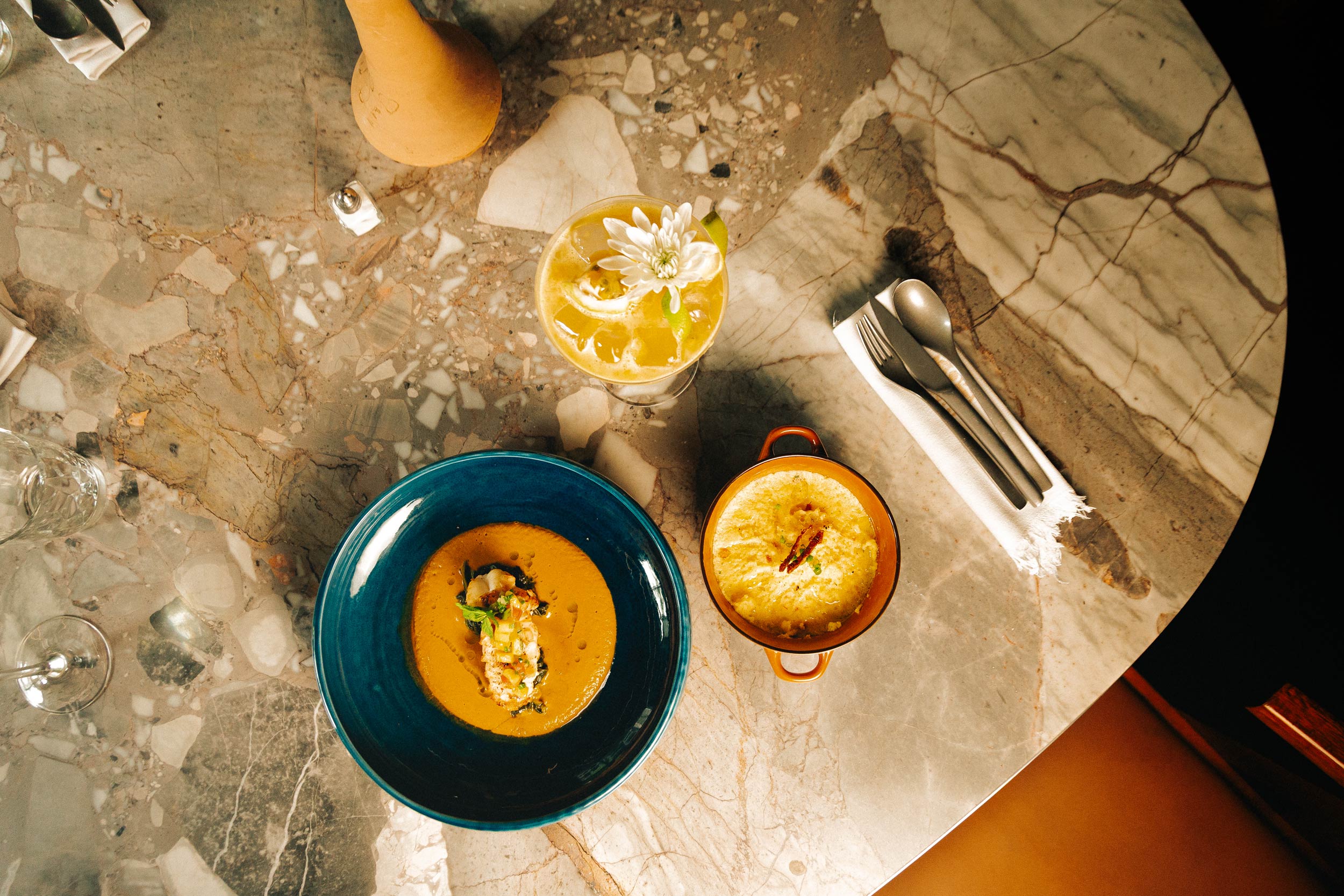
A vibrant new dining destination in Abidjan.
As part of Onomo’s expansion and evolving hotel brand architecture, Onomo Allure Abidjan Baobab was introduced as a premium offering within the group’s portfolio. Kandi was brought on board to develop the hotel restaurant branding for its in-hotel restaurant, Casa Baobab, a space built to celebrate Afro-fusion at its finest.
Client
Onomo
Industry
Hospitality
Project
Branding
Services
Brand discovery
Logo design
Visual identity design
Brand guidelines
Brand launch and roll out
Challenge
Bringing Afro-Mexican fusion to life.
Because of our previous hotel restaurant branding experience for the Onomo group, including Klok and Kokoma, we understand the importance of creating a distinctive restaurant identity while remaining connected to Onomo’s broader brand values.
Casa Baobab presented a different opportunity because of its clear Afro-Mexican culinary direction. African flavours and traditions meet Mexican inspiration in a vibrant dining experience, complemented by brunches, live music and entertainment.
Working closely with Onomo’s head office and regional team, the challenge was to create a distinctive brand experience that could bring together three key ideas: Afro-Mexican heritage, culinary excellence and an immersive guest experience.
Discovery
Celebrating a fusion of cultures.
Our discovery process explored the foundations of Casa Baobab as a new restaurant concept, from its culinary identity and cultural influences to its role within the Onomo Allure experience.
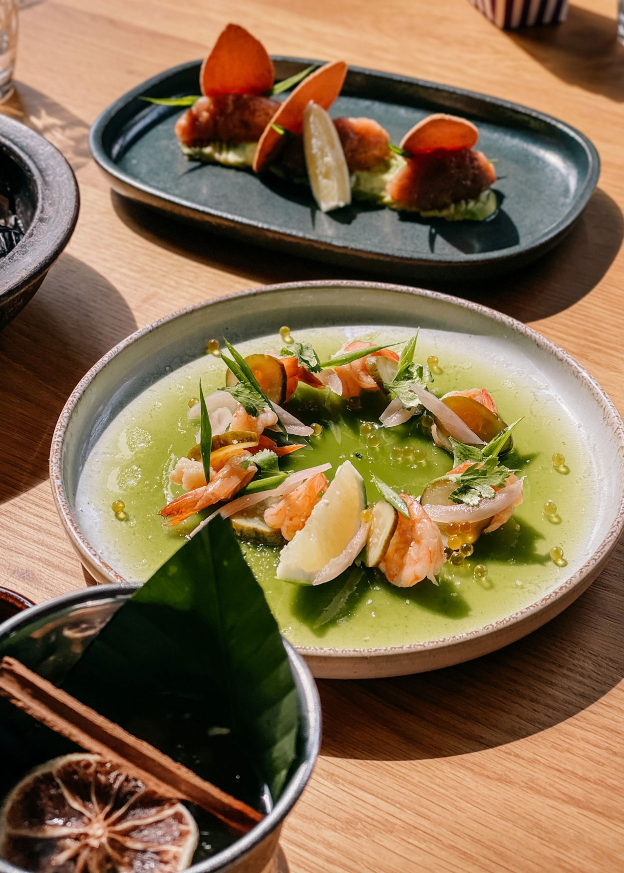
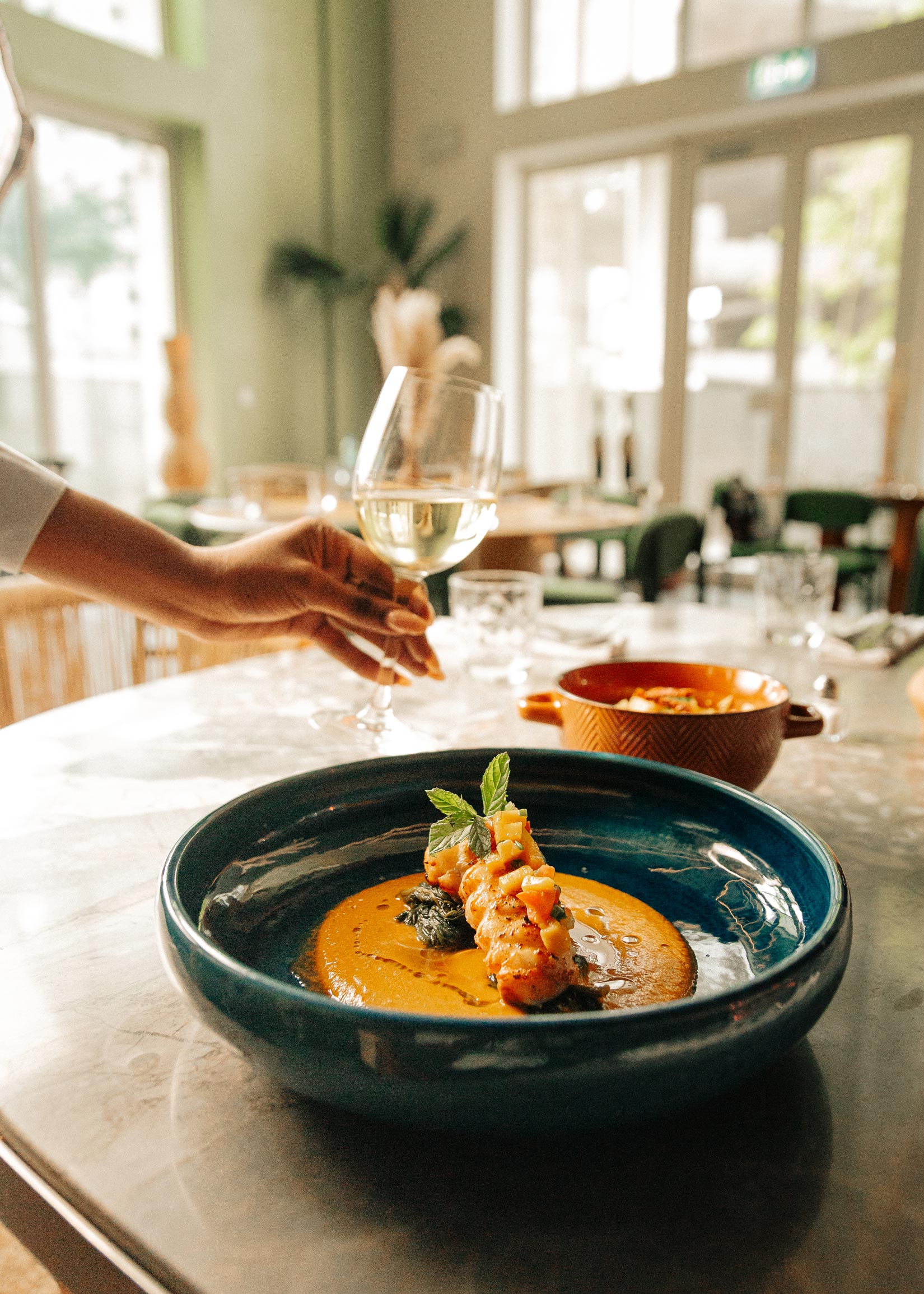
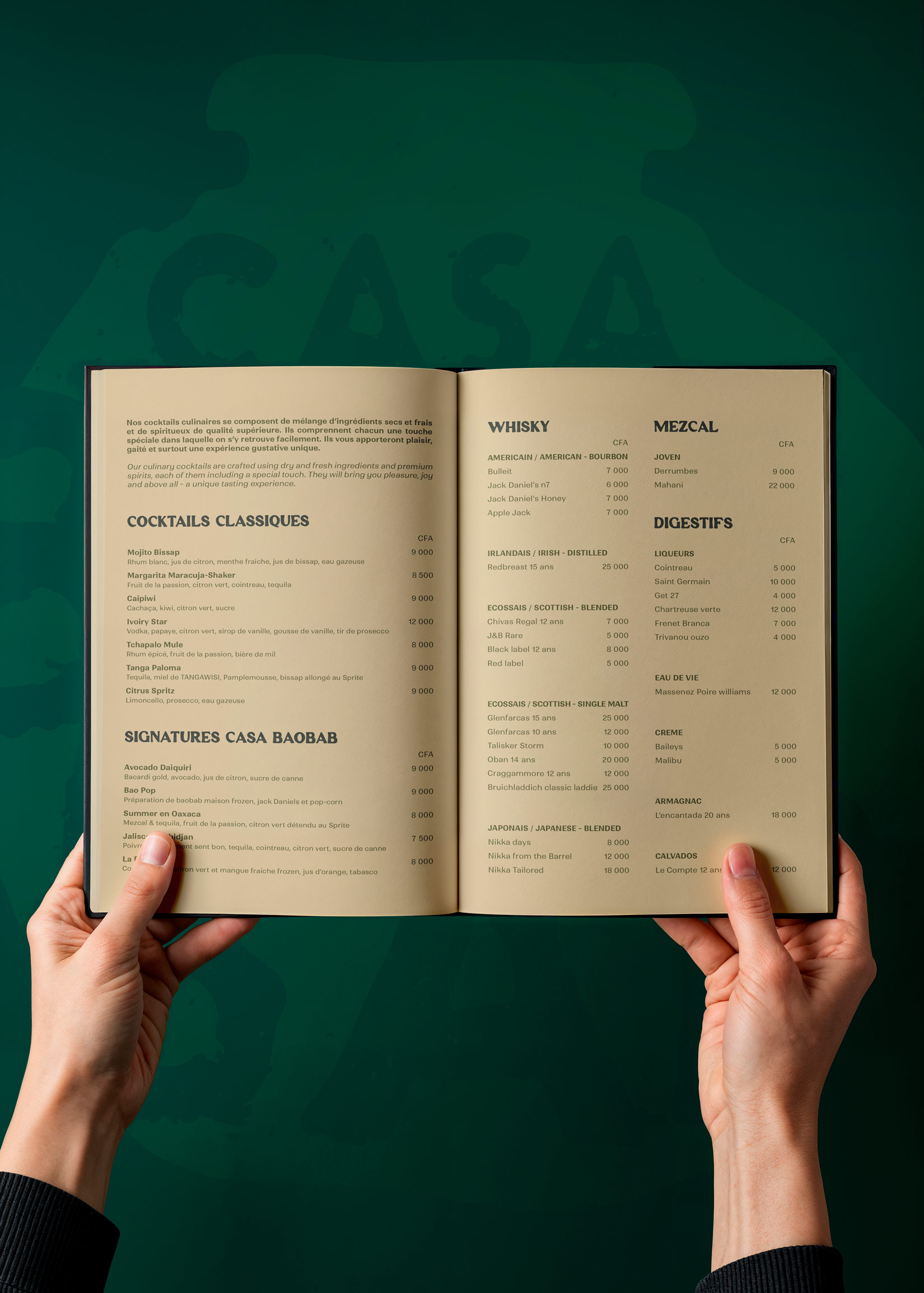
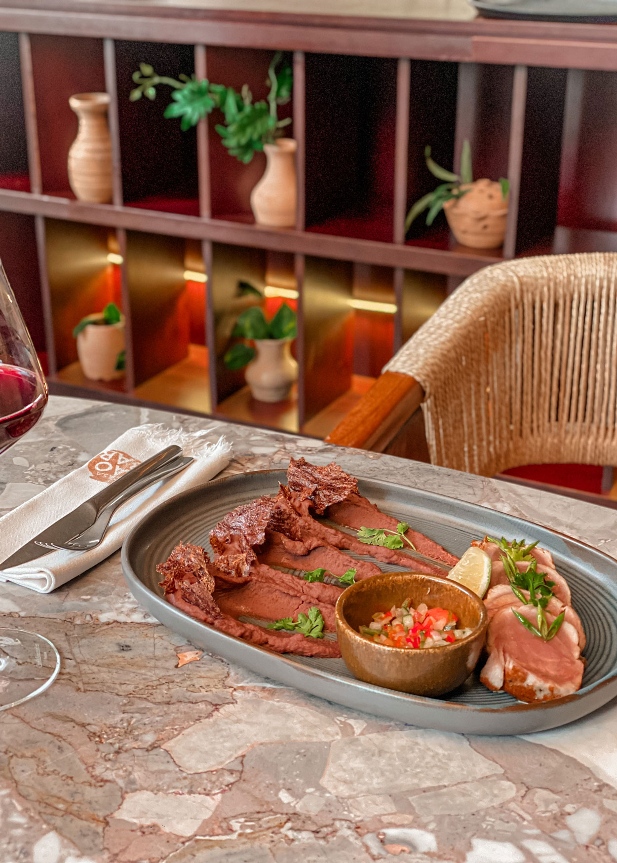
The objective was to create a brand that brought together the bold flavours, rich traditions and vibrant energy of African and Mexican cuisine. The menu, developed by Executive Chef Lorna Boboua-do Sacramento, provided an important source of inspiration, with creative presentations, layered flavours and hearty ingredients creating a strong foundation for the visual identity.
The name itself captures this fusion. Casa, meaning “house” in Spanish, represents the Mexican influence, while Baobab references the iconic African tree. Together, Casa Baobab translates as “The House of the Baobab”, bringing the two sides of the concept together in a simple, memorable name.
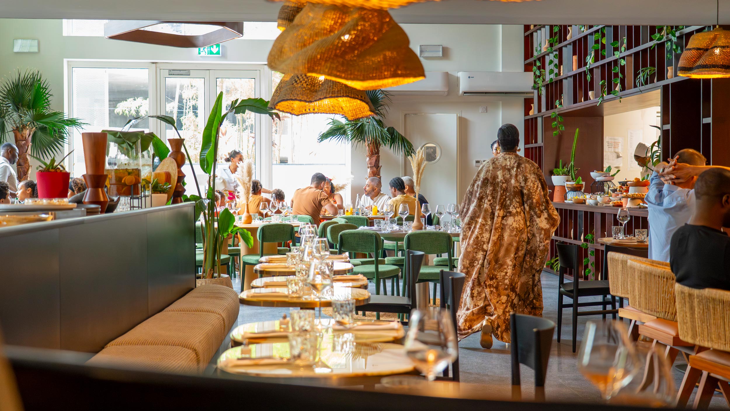
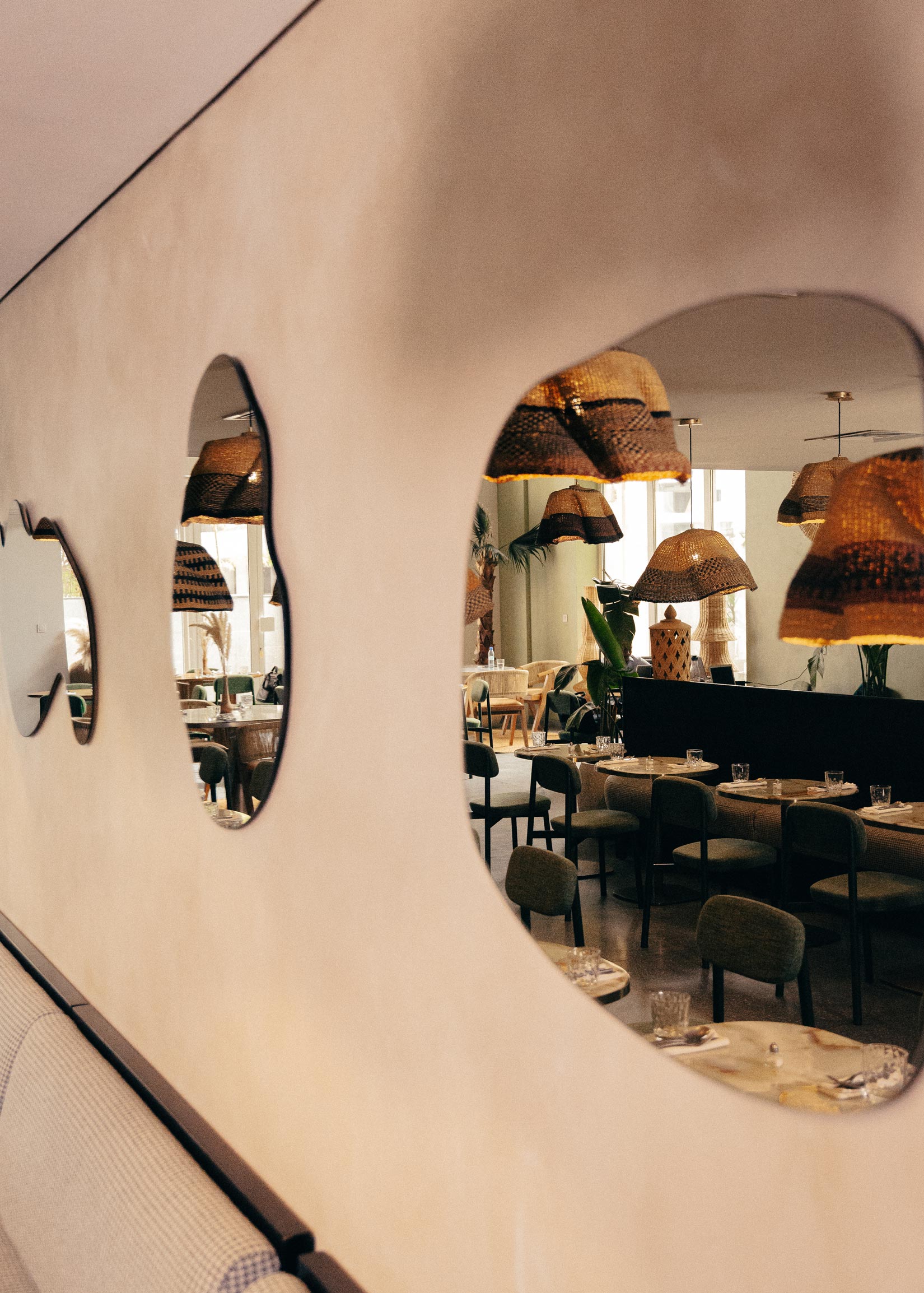
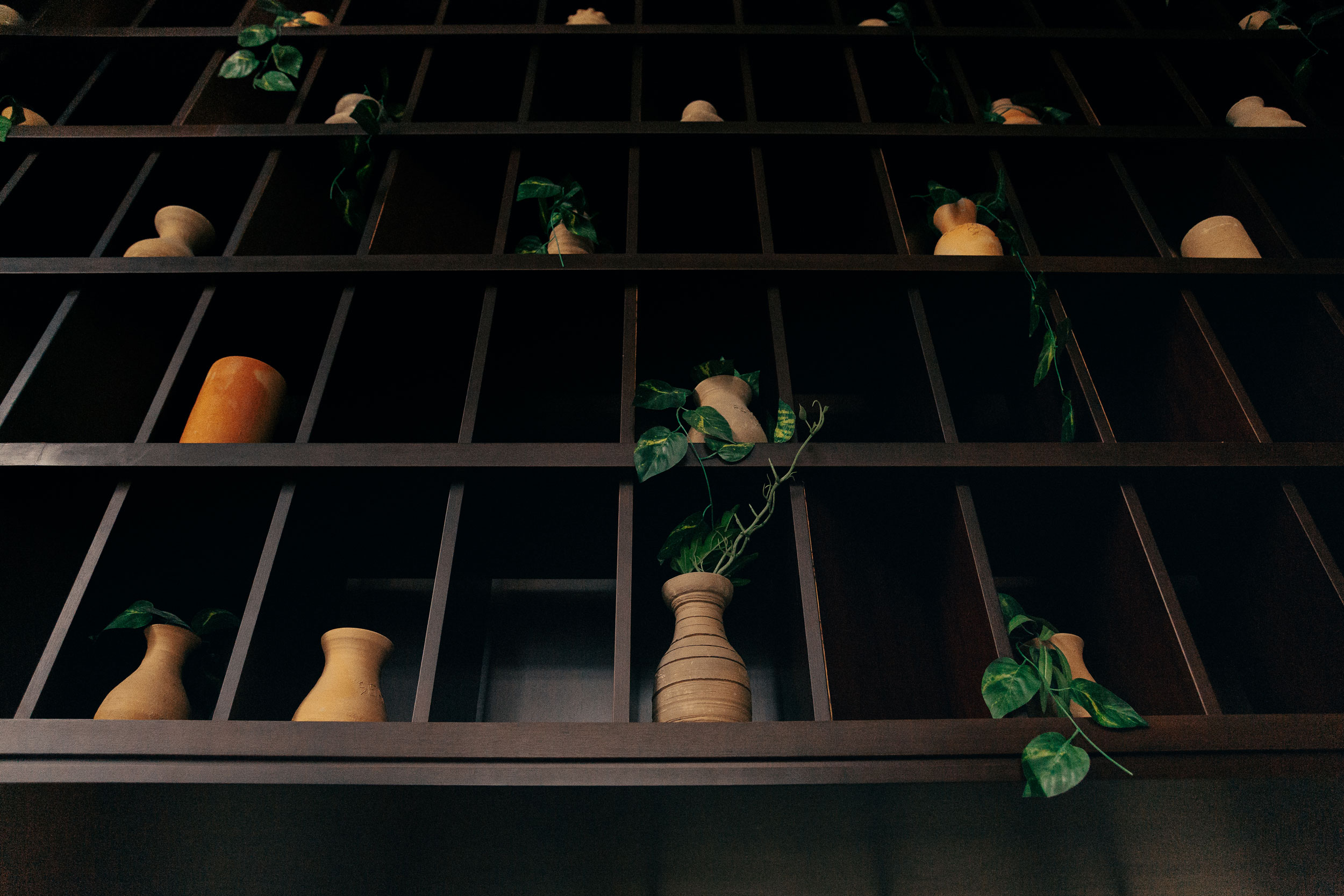
Finally, we also reviewed early interior design concepts, including earthy tones, clay pots and natural materials. Overall, these visual cues informed our exploration of the logo and identity, helping create a cohesive connection between the restaurant’s interiors and its brand.
Identity
Earthy, tactile and distinctly Afro-Mexican.
The visual identity combines African sensibility with Mexican influences to create a warm, expressive look that complements the restaurant’s distinctive atmosphere.
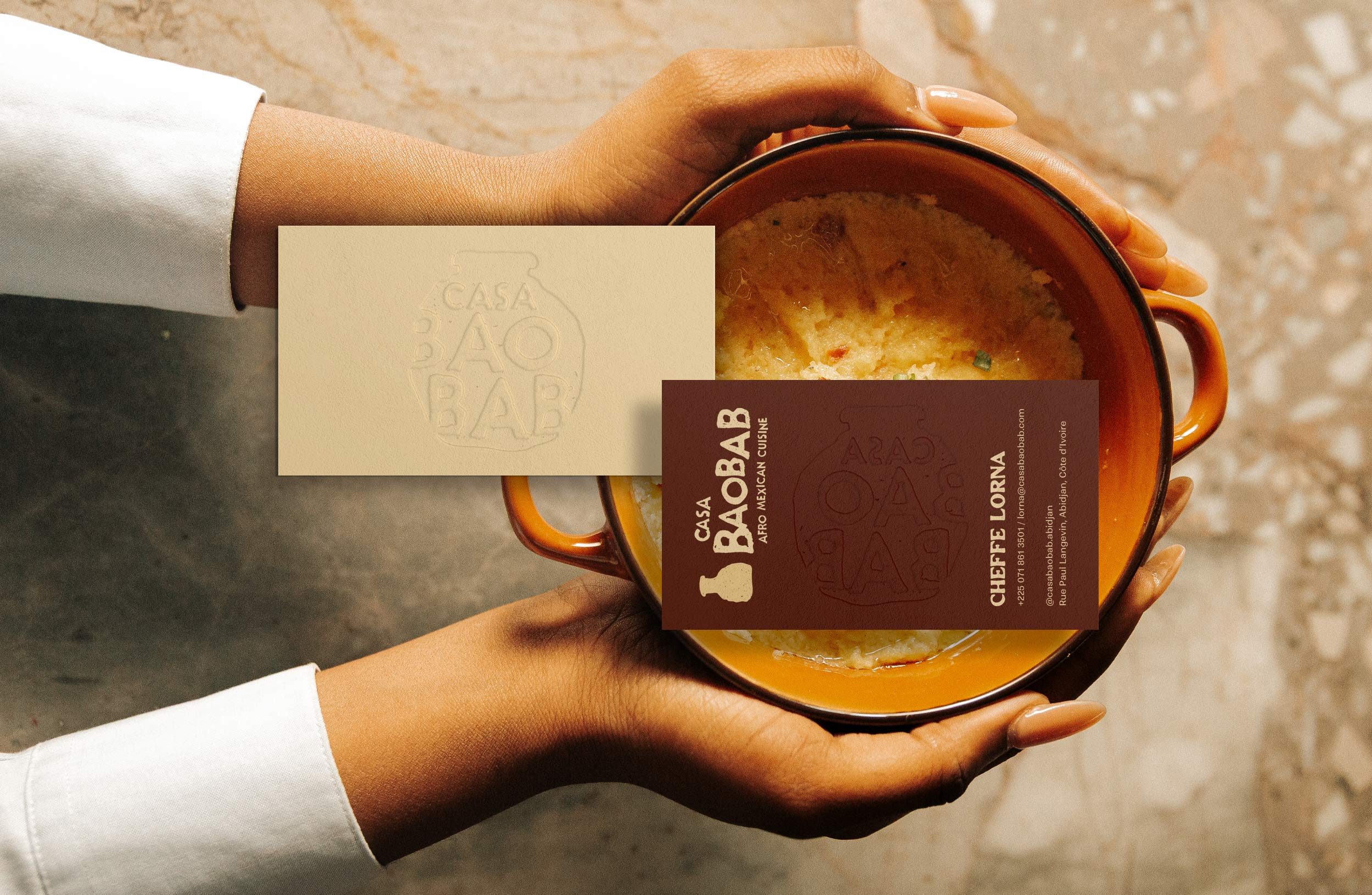
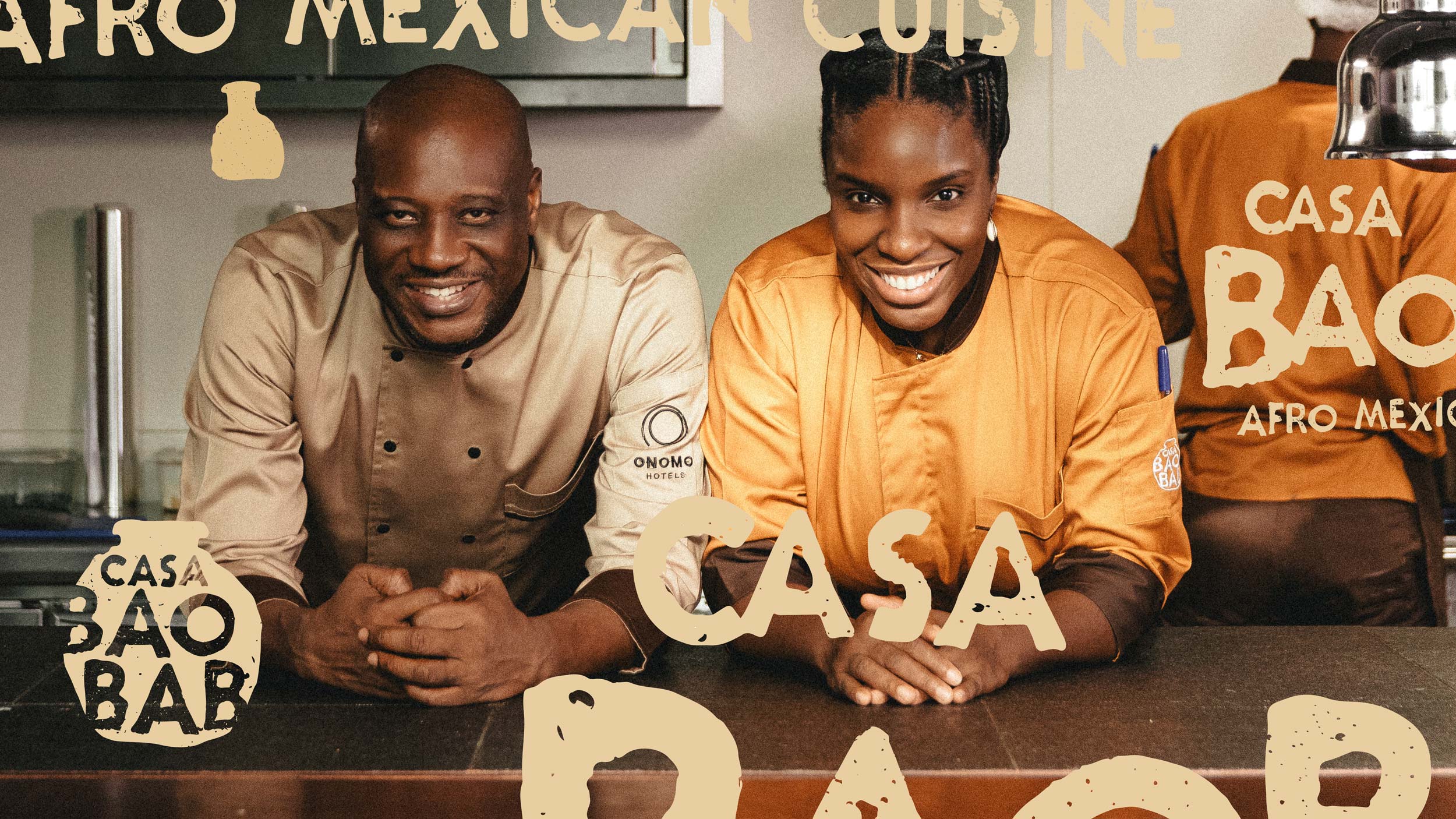
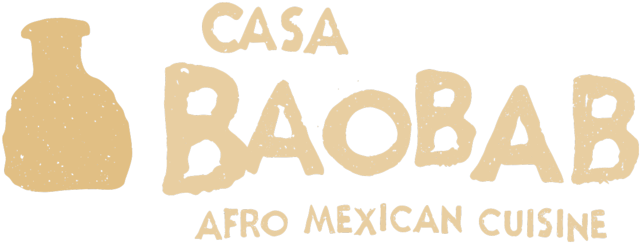
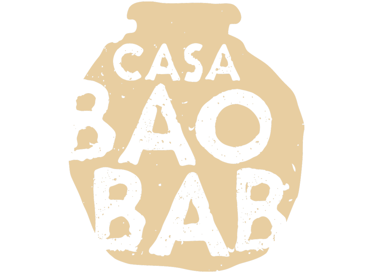
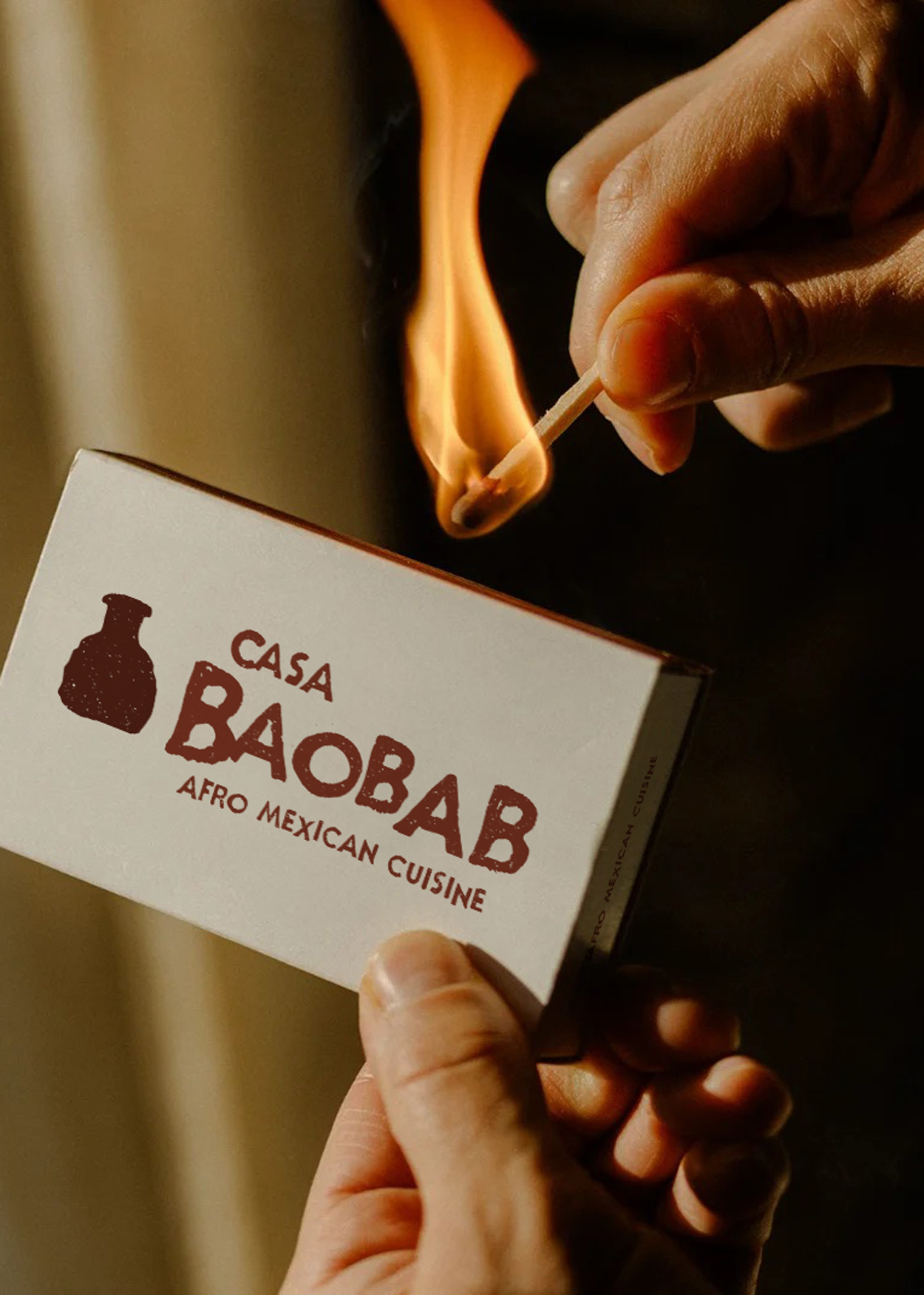
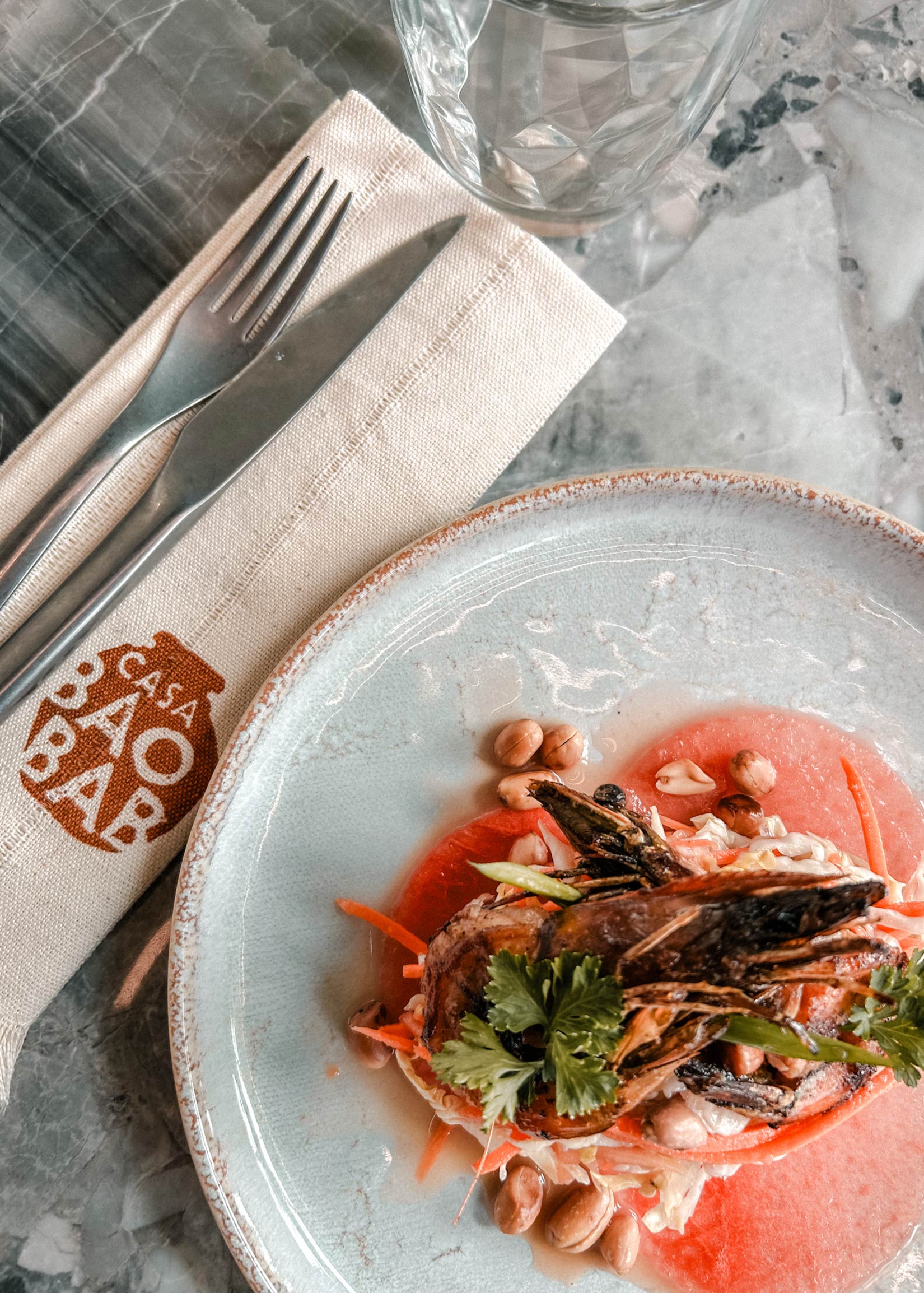
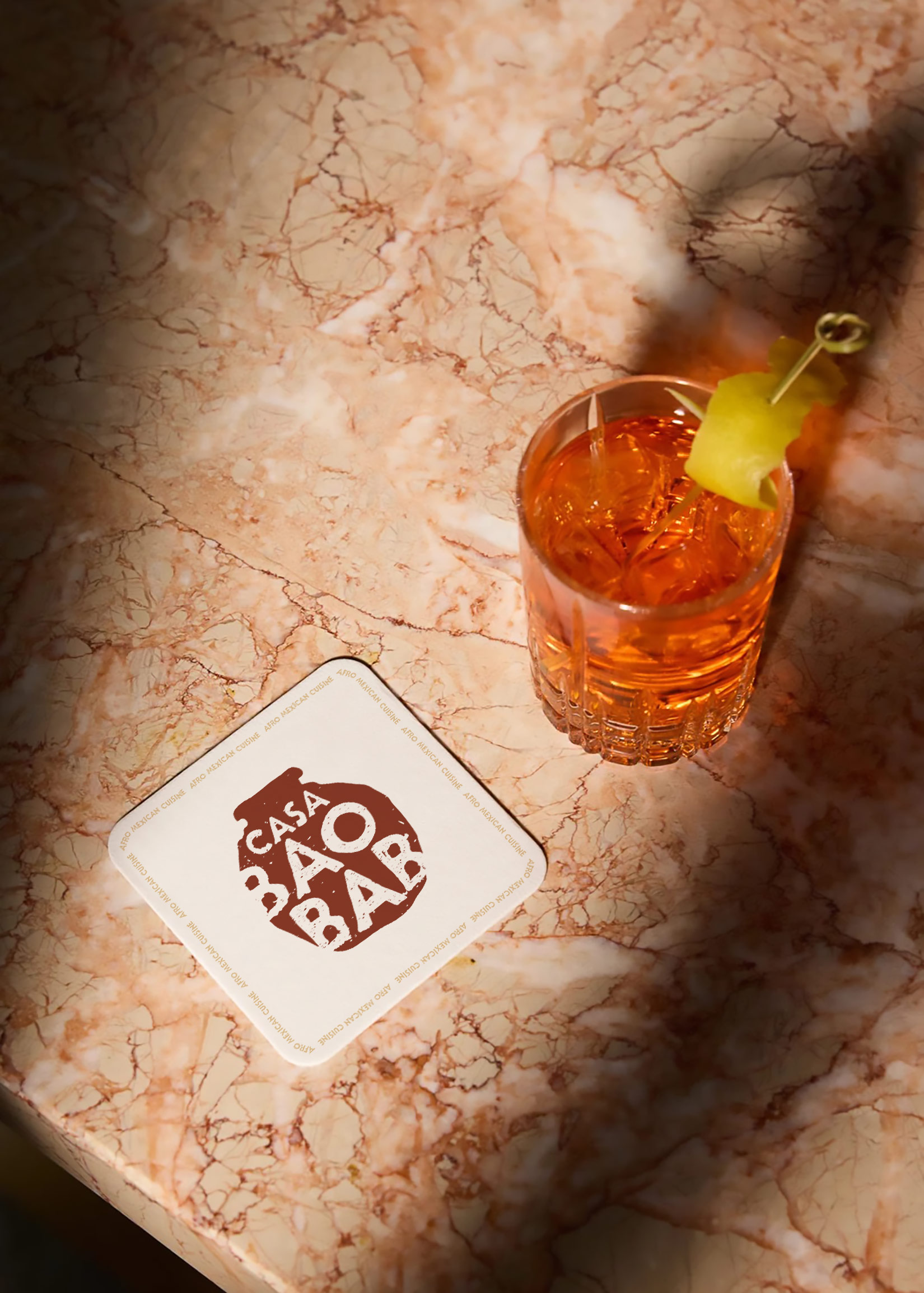
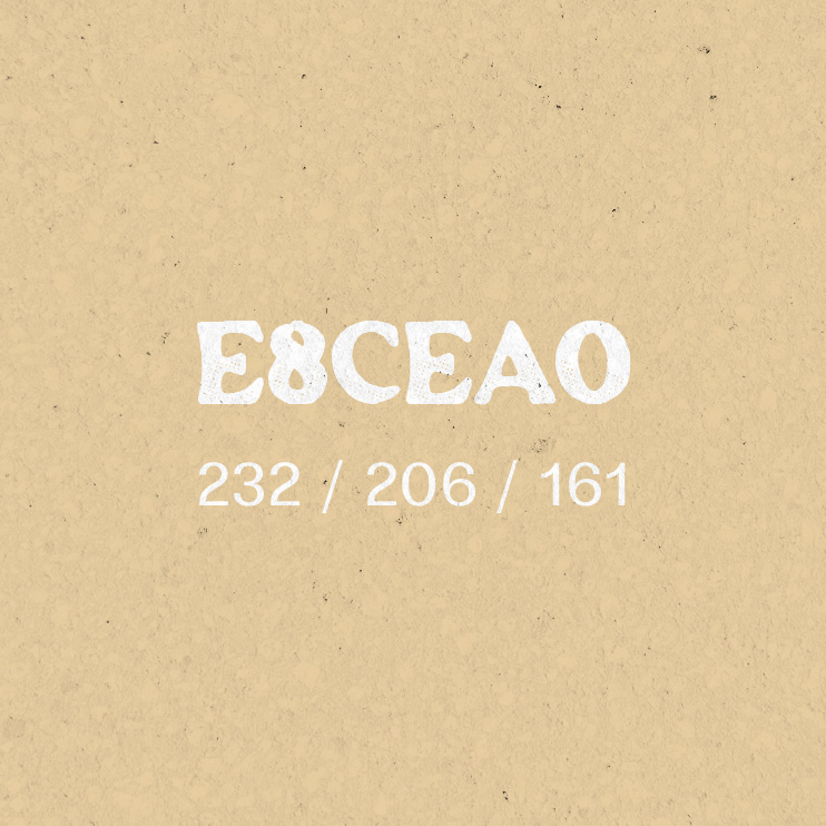
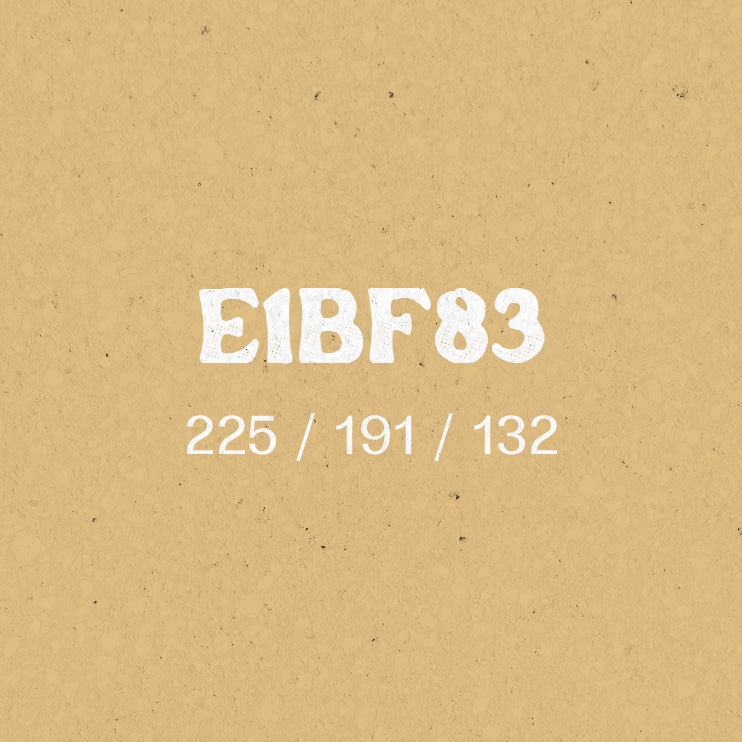
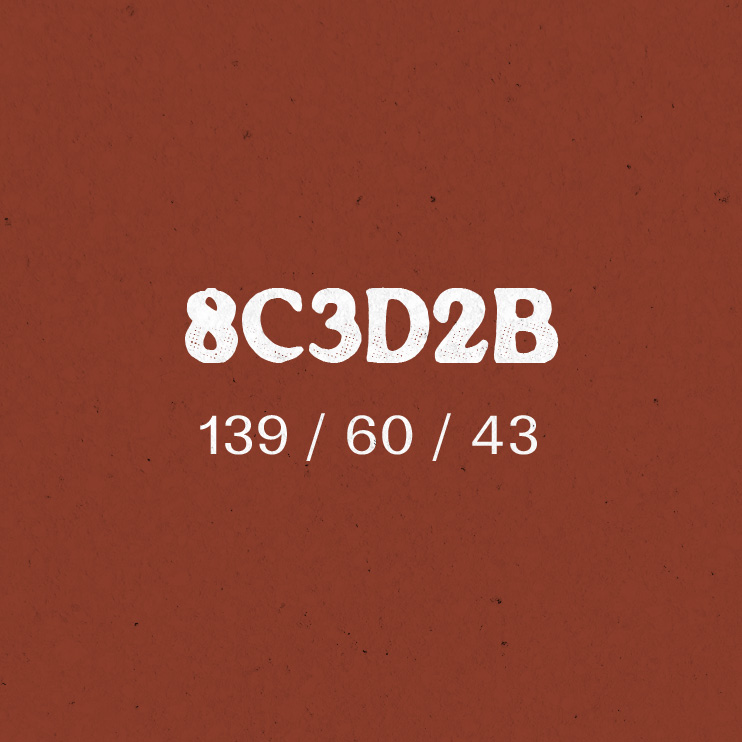
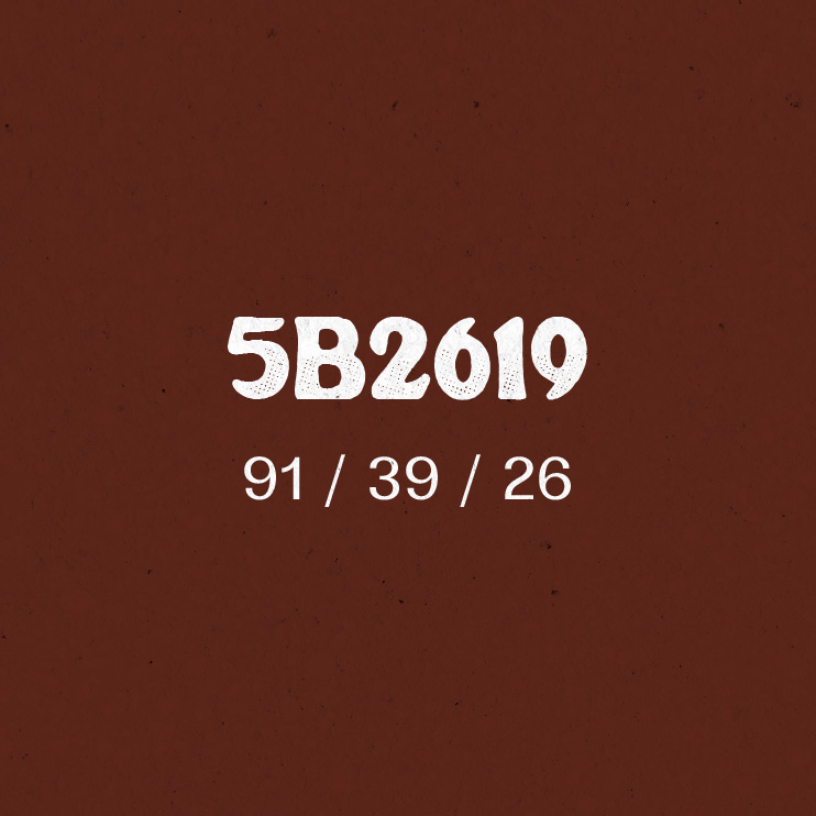
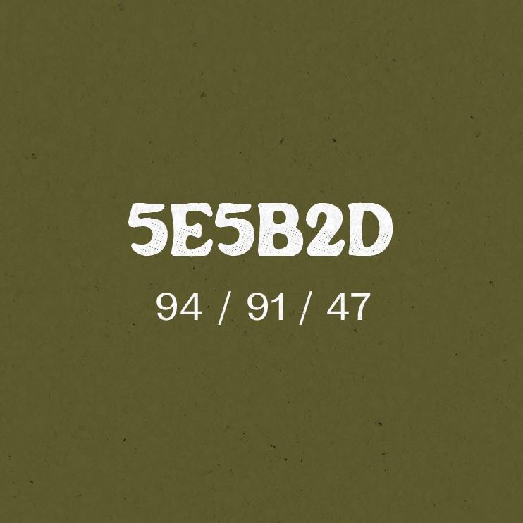
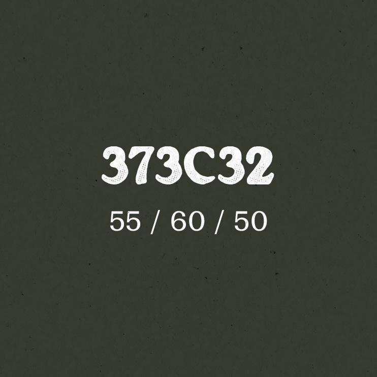
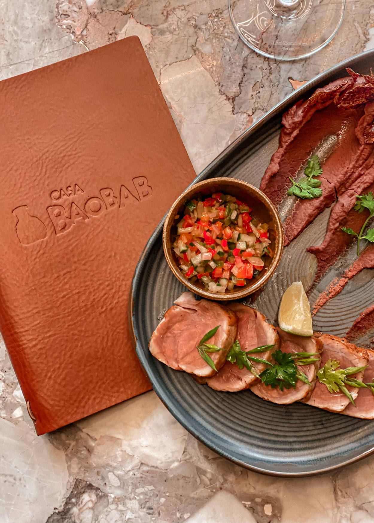
The logo incorporates pot-inspired forms, with a handmade logotype featuring subtle irregularities that add warmth and personality. Furthermore, two logo variations were developed for flexibility across different applications. A subtle texture adds a tactile quality to the identity, while a considered palette of terracotta, earthy neutrals and greens reinforces the natural, grounded character of the brand.
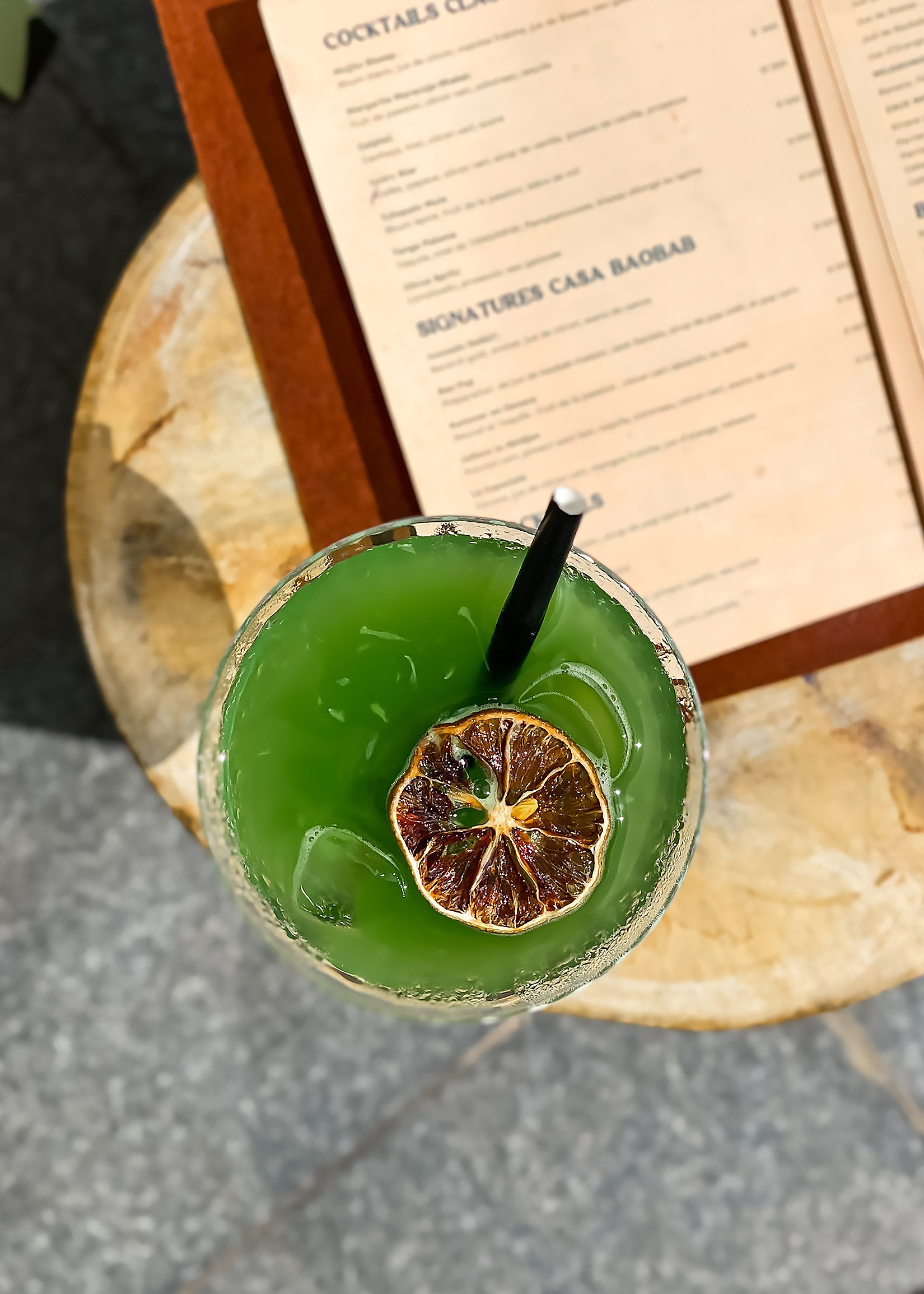
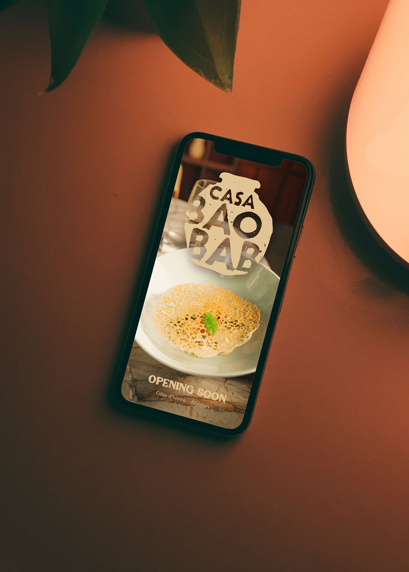
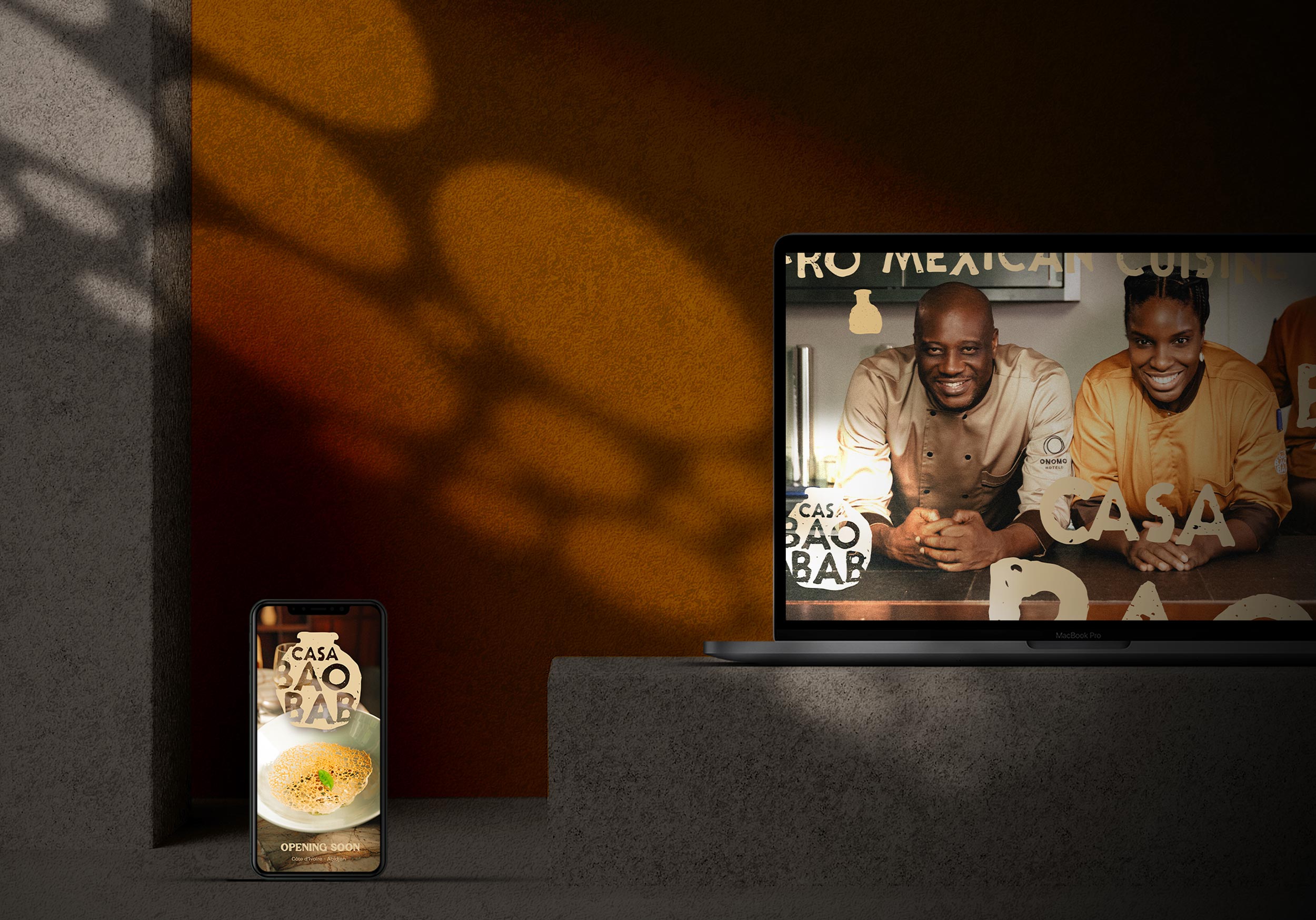
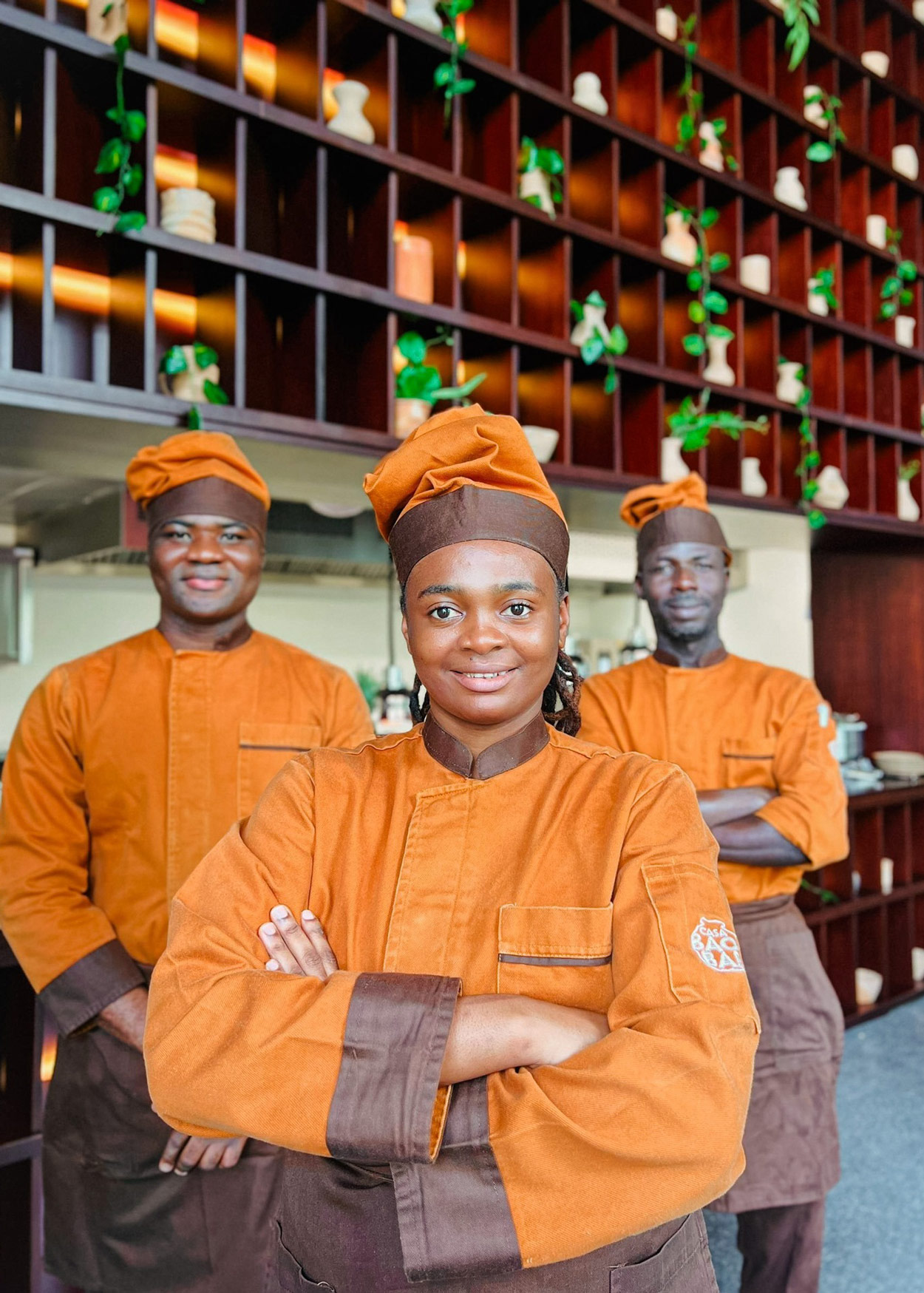
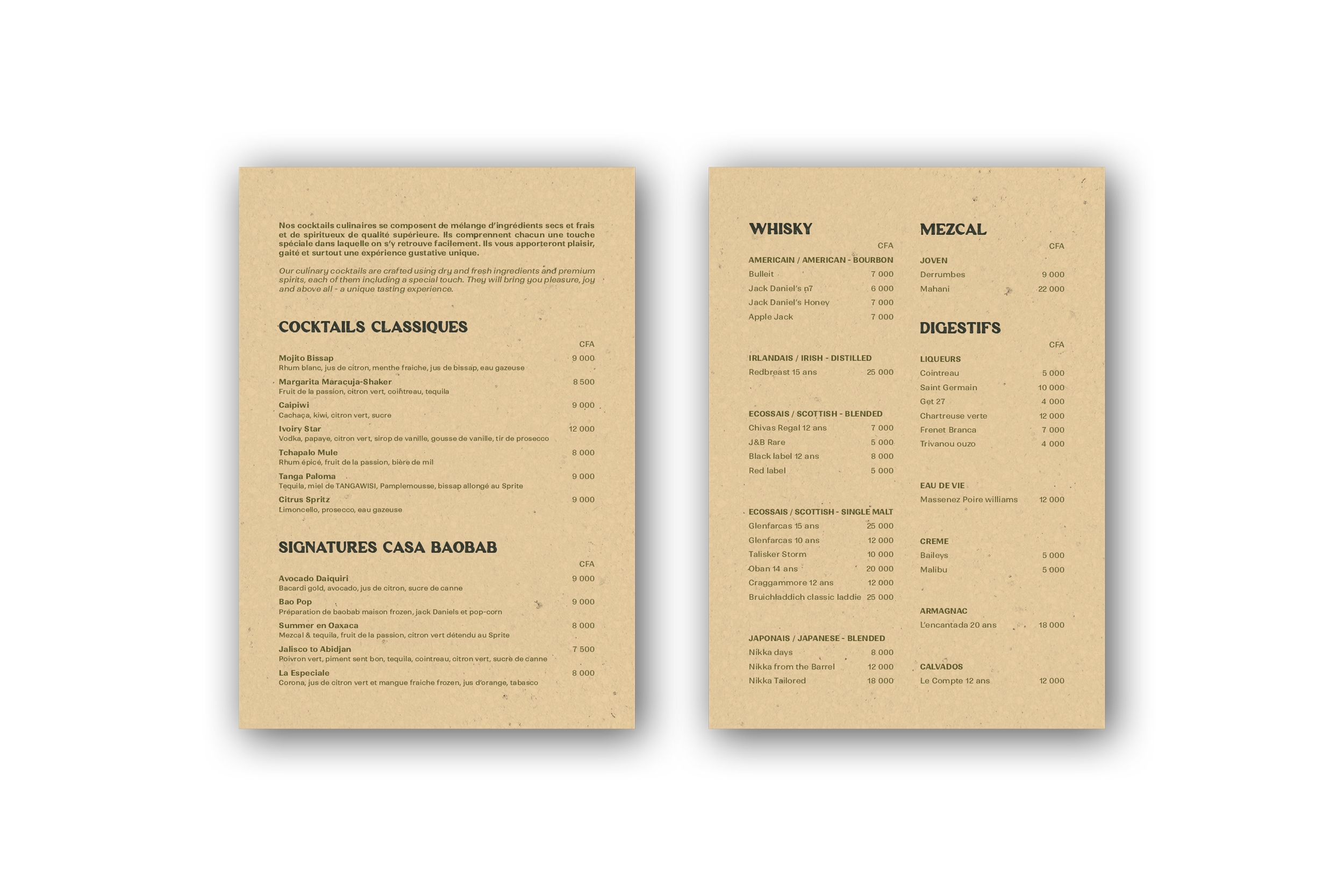
For the launch and roll-out, Kandi developed menu templates and in-restaurant collateral, including coasters, and branded uniforms. Finally, launch campaign assets were developed, bringing the identity to life across the guest experience.
Casa Baobab has since become one of the flagship restaurants in the Onomo portfolio. Specifically bringing the group’s Afro-fusion vision to life through a brand identity as vibrant and layered as the cuisine itself. From logo to table, the hotel restaurant branding now carries the restaurant’s story across every guest touchpoint.